The Elements of an Effective Landing Page: An Online Directory Case Study
Creating a high-conversion landing page is one of the most effective ways of marketing your online directory.
In this case, your landing page would be an Advertise Page because you are building an online directory, and your main goal is to find advertisers to buy premium listings or ad space.
I’ve seen far too many directory websites without a decent Advertise Page or neglecting the importance of this type of page.
On this page, you will provide business owners with the information needed to choose to buy premium listings or ad blocks.
Or if you offer the service (you should), to hire you to manage their online presence.
This entails creating one or more sales pages that are distraction-free and helps the visitor focus on the message well enough that they want to make a purchase.
A high-converting landing page means more people are turned into customers than those who exit the page or decide not to make a purchase.
The higher your conversion rate, the more sales you generate.
For that to happen, you must give maximum visibility to your landing page.
- It must be linked in the header of your main navigation menu.
- Calls to action buttons linking to that page should be available through your directory website’s content.
- It must be SEO optimized so that Google can show it to people in your niche looking to spend their marketing budget on online marketing.
- Your Social Media profile and posts should often link to it.
- You can buy ads on Google for specific keywords that are harder to rank for.
- Finally, you can create social media ad campaigns and link them to your sales page to increase sales.
While you can set up a sales page quickly and easily, however, there are key elements that need to be considered carefully:
- Enticing above-the-fold content
- A prominent, engaging headline and Call to Action (CTA)
- An informative and interesting subheading
- Strategically positioned images
- Balanced, uncluttered design and layout
- Color psychology
- Provide social proof
- Trust badges, logos, and guarantees
- Provide live chat and other user-friendly contact channels
- Funnel marketing
You can find more information on these in detail below.
1. Enticing Above-The-Fold Content
Above-the-fold content on a webpage means whatever text, images, and other elements a person sees when visiting the website without having to scroll down the page.
This area is crucial because if the content isn’t enticing and engaging, there’s no reason for the visitor to continue browsing the page.
Above-the-fold content can include a prominent, emotional, and thought-provoking image, video background, headline, subheading, Call to Action (CTA), and other relevant elements you choose.
Keep reading for more details on these types of content.
2. Prominent, Engaging Headline and Call to Action
A headline and CTA are typically one of the most critical elements of a landing page because it’s what visitors will likely see first.
This means they must be carefully crafted to ensure they provoke curiosity in your visitors.
The more curious they are, the more likely they’ll keep scrolling through the page.
A CTA (call-to-action) is designed to prompt the visitor to take action on something you want them to do.
For example, you could write a CTA asking visitors to create a listing, buy an advertising package, sign up for your email newsletter, or to buy something.
Good CTAs are short, sweet, and get to the point quickly.
If you don’t have a CTA, your visitors can’t be sure what you want them to do. That means they may not take action the way you want.
3. Informative and Interesting Subheading
After the CTA headline, it comes the subheading.
It should be just as engaging, but it should offer more information.
They’re typically between one to three sentences long, but be careful not to be too wordy.
Get straight to the heart of the matter and offer details that are relevant as well as compelling.
A subheading should detail how your online directory is highly rated, well-established, and popular or provide other relevant and enticing details to your target audience.
Your CTA is meant to spark interest, while the subheading offers enough detail to quench your visitor’s curiosity while creating even more curiosity.
That way, the reader continues scrolling through the page and engaging with your content.
You’ll have a greater chance of convincing them to take the action you want.
4. Strategically Positioned Images
When you add images to the page, it should be done thoughtfully. Don’t add images and photos just for the sake of it.
Sometimes they are not needed at all.
If used, images you add should be congruent with your ads.
This means that if you display an image in an ad, that same image should be in your above-the-fold content on your landing page.
Not only will this help your marketing look cohesive, but it will also help boost your sales.
The reason is that the person clicked on your ad in the first place, which means they found the image compelling.
So, if you use the same image on your landing page, it will continue to compel them enough to continue scrolling.
5. Balanced, Uncluttered Design and Layout
The design and layout of your landing page should be clean and uncluttered.
That way, your visitors can stay focused on your content and your CTAs.
This also means that you should remove any elements of the page that takes away their focus or makes them click on another page.
This includes removing any navigation links at the top of your page, for example.
6. Color Psychology
You can also use the psychology of color in your landing page’s design to make your page more eye-catching and enticing to your visitors.
For details on implementing color psychology, check out The Psychology of Color in Web Design.
7. Provide Social Proof
Social proof means evidence that people support and love your business.
This looks like testimonials, whether they’re written or in video form, for example. You could also use tweets and other social media posts.
Adding social proof to your landing page is crucial since it helps build trust with your audience.
If they see that other people like your online directory, it will help convince them to join in.
The more details you can provide, the more trustworthy your social proof appears.
This includes elements such as a photo, name, location, or website for the person giving the testimonial.
8. Trust Badges, Logos, and Guarantees
Like social proof, you can add trust badges, logos, and a guarantee to further build trust with your audience.
A trust badge can look like a five-star review from a prominent and popular customer review site like Capterra.
You could also include a guarantee for your online directory.
A common one is a 30-day money-back guarantee.
If your customers aren’t satisfied within 30 days of purchase, they can get a refund.
Often, you would include a clause in your terms of service that offers the appropriate details.
The more generous the refund policy, the better.
9. Live Chat and Other Contact Channels
Including at least one way visitors can contact you quickly and efficiently is a great way to resolve their issues before they give up and navigate away from your landing page.
You can help solve their problem and offer your online directory as a solution.
Options include live chat, an email address, a contact form, Facebook Messenger, other social media platforms, a support forum, or other avenues that make sense for your directory.
Whatever communication channels you offer, be sure they’re easy to access and user-friendly.
Offering more than one option is also ideal, especially if you have a live chat option that isn’t available 24/7.
10. Funnel Marketing
Funnel marketing is one of the key components of a landing page.
A funnel is a path you want your visitors to take when scrolling and navigating your landing page.
It starts at the top of the page, then gets more specific and targeted as you go.
For example, you could start with the visitor reading a sales copy or watching a sales video.
Then, you could display a CTA that prompts them to purchase a listing.
You could offer an additional item at a higher price to gain more revenue.
If the customer decides they don’t want the additional offer, you could then present them with a second product or service that’s at a much lower price.
If that doesn’t entice them, you could direct them to sign up for your free newsletter.
That way, you get more future opportunities to sell to your customers.
You can design your sales funnel in so many ways using the GetPaid add-on.
There’s no set, correct way to plan a funnel.
The best kind of funnel is the one that converts the most visitors into customers while generating the most revenue.
Now let’s break down a real-world example.
Landing Page Case Study Breakdown
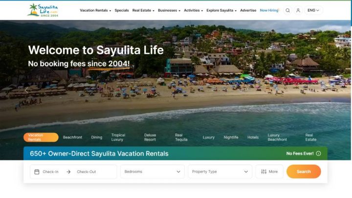
For this case study, I decided to review a directory that most (or all) of you probably never heard about: Sayulitalife.com
This directory covers a Surf Town close to where I live, and I’ve been keeping an eye on it since I moved here.
Sayulita Life is a website that showcases the beauty and lifestyle of the coastal town of Sayulita, Mexico.
The website provides visitors with a wealth of information about Sayulita, including its history, culture, and local attractions.
It also offers a wide range of services, such as travel planning and accommodation booking, to help visitors make the most of their time in Sayulita.
The website features stunning photography that showcases the town’s breathtaking scenery, as well as articles and blog posts about life in Sayulita, from its vibrant food scene to its thriving surf culture.
Even though Sayulita is a tiny surf town, this exceptionally well-positioned directory outranks sites like Airbnb, VRBO and TripAdvisor.
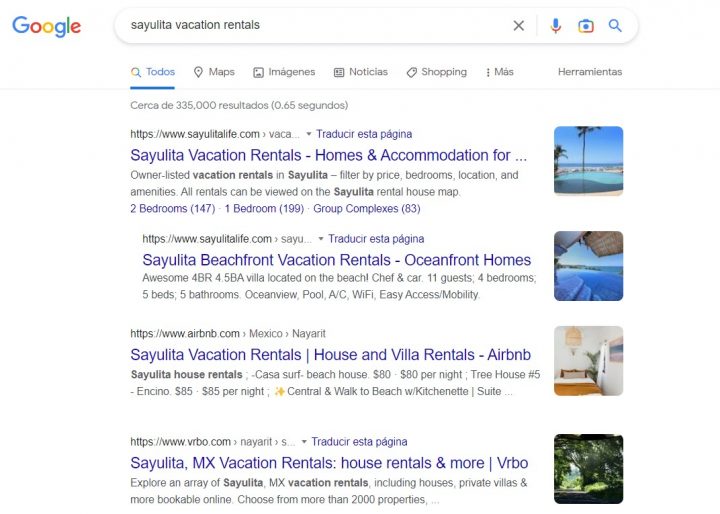
I estimate that it generates high-six figures per year.
Unfortunately, they are not using GeoDirectory, because they started their custom application in 2004, ten years before we even existed.
That said, a directory like this could be replicated almost identically with our plugin (especially with the upcoming FSE theme and booking engine).
Performance-wise, GeoDirectory would work even better.
Let’s examine their advertising landing page to ensure it includes all the previously discussed elements.
1. Above-the-Fold Content
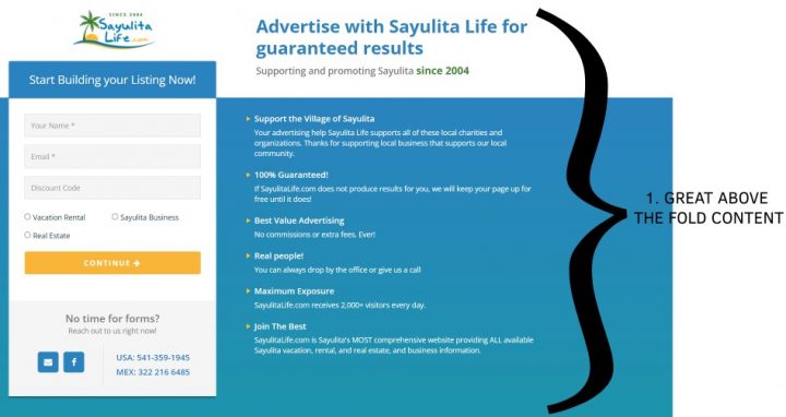
All information needed to make an informed decision are above the fold.
2. Heading & CTA
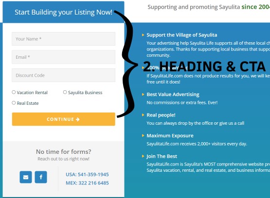
Main Heading and CTA are very prominent, and the form is as simple as possible to reduce the number of users not completing it.
3. Subheading
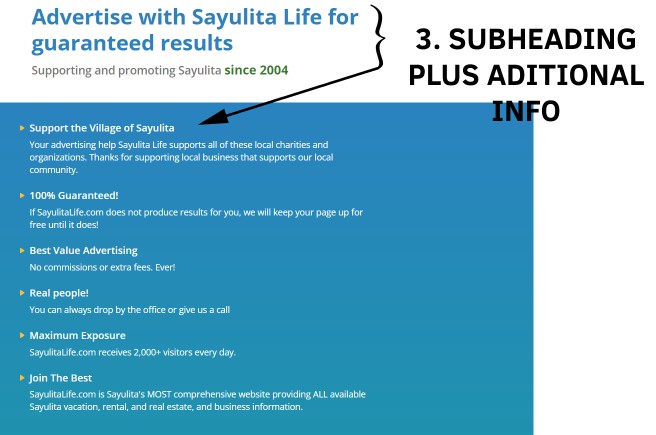
The subheading is present and comes with a bullet point of all info needed to detail how the directory is highly rated, well-established, and popular.
4. & 5. Images & Balanced Design/Layout
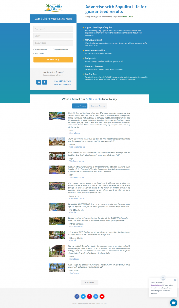
There are only small images on this landing page, but the layout and design are balanced and uncluttered.
6. Color Choice
The white and light blue color palette is often used because it’s non-invasive and associated with dependability.
7. Social proof
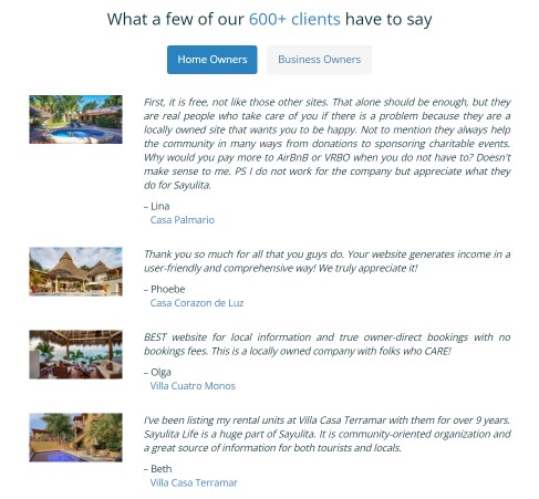
Sayulitalife.com advertising page provides abundant social proof
8. Trust badges and guarantees
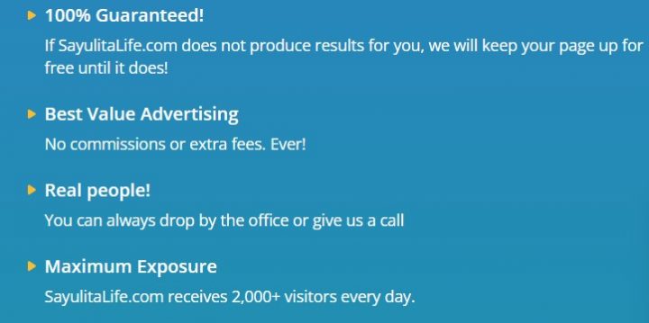
With this phrase alone, they go above and beyond:
“If SayulitaLife.com does not produce results for you, we will keep your page up for free until it does!“
They know they can keep their promise, so they offer a 100% satisfaction guarantee.
9. Live chat
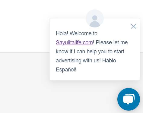
The Live Chat is there as expected.
10. Funnel marketing
I never purchased from them, so I don’t know if the checkout process includes Order Bumps, Upsells or Downsells.
However, given this directory’s incredibly well-managed operation, I wouldn’t be surprised.
Conclusion
If you neglected your advertising page, that’s possibly the reason why you don’t see exceptional results.
If you are building a Travel Directory (or any directory related to Geographical businesses), back-engineer as many websites as possible, like sayulitalife.com.
You will find the way to success.
Would you like me to roast your landing page? Send the link in a comment down below, and I’ll share my thoughts!
You can get GeoDirectory here today:
Newsletter - Stay Updated!
Get the latest news, tips, and exclusive content directly in your inbox.