Create an Airbnb-like listings page with GeoDirectory and Avada
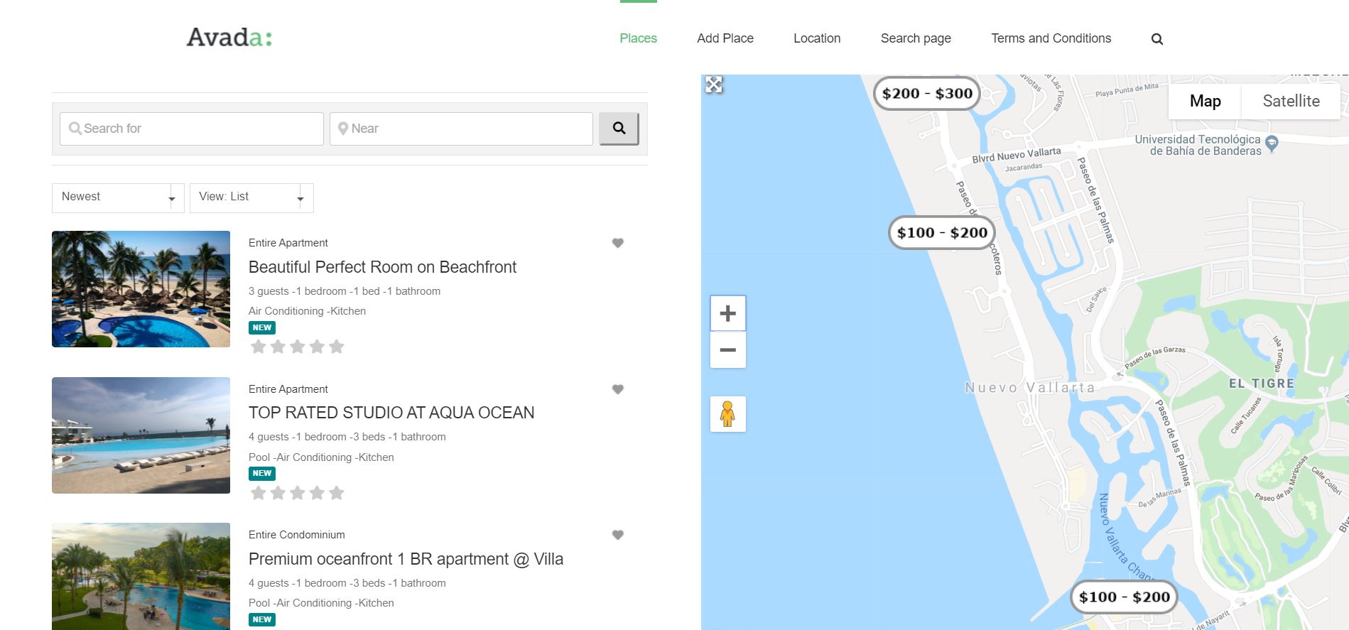
approximately 6 months ago we released V2 of GeoDirectory and we promised it would be a lot easier to customize your design with it.
Being compatible with most page builders and themes, you could already do fantastic template designs with GeoDirectory V2, but now that we are fine-tuning it, you will be able to do even more awesome stuff with it.
We decided to start with Avada and the Fusion Builder.
With the current version of GeoDirectory, you had to :
- add new widget areas in Avada
- add the GD widgets needed to complete the design
- finally, use these widgets areas through the Fusion Builder
You could achieve almost anything with that and CSS later, but it wasn’t intuitive nor as easy as customizing a design with the default elements of Fusion Builder.
GeoDirectory Elements will be within the Fusion Builder
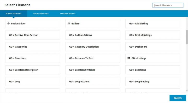
From the next version of GeoDirectory which will be 2.0.0.68 (beta available on GitHub now), all GeoDirectory Widgets / Shortcodes / Blocks, will also be available as Elements of the Fusion Builder.
This makes it a lot easier to design, and we can now dig into the tutorial on how to create a page to look similar to Airbnb’s listings page or search results page.
Assuming you have installed Avada and GeoDirectory, this is how I made it.
Disclaimer: It was not possible to design a page that looks like Airbnb ONLY with GeoDirectory and Fusion Builder. I had to write a few lines of CSS. 11 new rules, 5 for the archive page template (the listings page) and 6 for the archive item page template (each listing inside the listings page).
That said, I’m not really an Avada expert, and there are so many options that probably what I did, could be done without as much CSS. Maybe even none.
I’ll leave that to Fusion Builder Masters to tell. If you know of solutions to avoid my custom CSS, I’d appreciate you letting me know via a comment down below, and I’ll update the tutorial.
1 Create the needed Custom Fields
I started adding the custom fields that AirBnB uses through Place > Settings. I only added the exact one I needed to replicate the design and save time, but everything can be done.
We needed four selects for :
- Guests
- Bedrooms
- Beds
- Bathrooms
and one multisect for amenities like:
- Kitchen
- Pool
- Air Conditioning

2 Editing the Archive Page Template
After publishing a few dummy listings, I needed a new Archive Page template. I called the page Avada Listings 1 and assigned it via GeoDirectory settings as the new Archive page template.
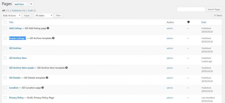
Then I needed to prepare the page and make it use the entire screen. I know there is an option to make Avada pages use the full-width of the screen, but that affects the whole site, so I used CSS to do that.
.geodir-archive #main .fusion-row {max-width:100%}
html:not(.avada-has-site-width-percent) .geodir-archive #main {padding:0}
.geodir-archive #main  {padding:0}
.geodir-archive .post-content .fusion_builder_column_1_2.fusion-column-first > .fusion-column-wrapper {padding-left: 8% !important;}
.geodir-archive .avada-page-titlebar-wrapper {display:none}
What the above does is simple. Makes the area below the header and above the footer using the full width of the screen, removes general padding, and adds padding only to the left of the listings list. It also hides the Avada title bar that, on a similar page, is not necessary. The page will look like this:

Now we can edit the page with Fusion Builder. You can use both Front End and Back End, but the preview of the Front End won’t be 100% accurate, the reason why I used the back end builder.
We need two columns, and in the right column, we will add the GD > Map element, while in the left column, we will add :
- GD > Search
- GD > Loop Actions
- GD > Loop
- GD > Loop Paging
The only options that we need to tweak are for the Map, where we need to set the height at 85vh. To obtain the fixed map effect on scroll, I used a plugin called: Sticky Menu (or Anything!) on Scroll by Mark Senff.
We could have written our own custom JS, but this plugin is lightweight and if you only have 1 element to stick to, it works like a charm.
If you set it up correctly, it also pushes the map when the footer appears.
As options for this plugin, I set the following:
- Sticky Element = .geodir-archive-map-wrap
- Push-up element = .fusion-footer
The Push-up Element option can be found in Advanced Settings.
That’s it for now.
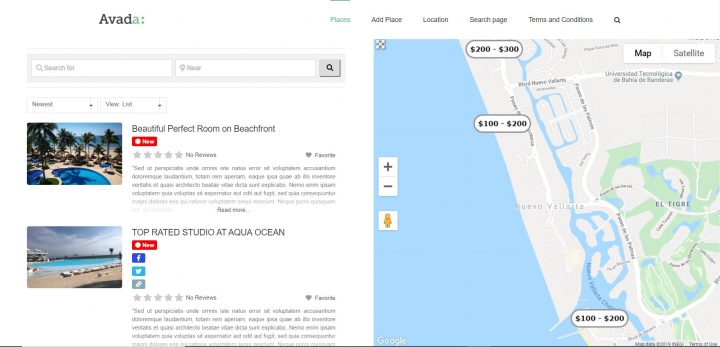
The page now will look like this:
3 Editing the Archive Item Page Template
Now I need to customize the design of each listing, and that can be done by editing the Archive Item Page template.
I created a new Archive Item Page template, and I called it: GD Archive Item-avada
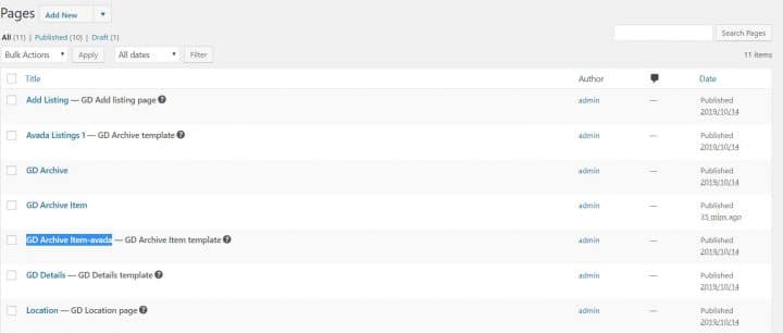
I opened it with the Fusion Builder back-end editor, and I added the following GD Elements:
- GD > archive item section set as open left
- GD > post images set as a slideshow
- GD > archive item section set as close left
- GD > archive item section set as open right
- GD > post meta with key=”post_category” and show=”value”
- GD > post favorite with show=”icon” and alignment=”right”
- GD > post title
- GD > post meta with key=”how_many_guests” and show=”value” and alignment=”left”
- GD > post meta with key=”how_many_rooms” and show=”value” and alignment=”left”
- GD > post meta with key=”how_many_beds” and show=”value” and alignment=”left”
- GD > post meta with key=”how_many_bathrooms” and show=”value”
- GD > post meta with key=”amenities” show=”value”
- GD > post badge key=”post_date” condition=”is_less_than” search=”+30″ badge=”NEW” bg_color=”#008489″ txt_color=”#ffffff” size=”small”
- GD > post rating show=”stars” alignment=”left”
- GD archive item section set as “close right”
4 Adding some more custom CSS
Last thing I needed some CSS to make things look pretty and organized, like on the Airbnb page:
.geodir-post-title, .geodir-post-rating {clear: left;}
.geodir-field-amenities li::after,.geodir-field-how_many_guests::after,.geodir-field-how_many_rooms::after,.geodir-field-how_many_beds::after {content:" - ";}
.geodir-field-amenities ul {margin:0;padding:0}
.geodir-field-amenities li:last-child::after {content:"";}
.geodir-field-amenities li {list-style: none;float: left;}
.gd-badge-meta {display: block;margin-left: 0;clear: both;}
The above CSS will only work if you have the exact same custom fields and does the following:
- adjust the position of the title and rating stars
- adds the ” – ” separator between the custom fields
- adjust the amenity multi-select, that by default is presented as a list
- adjust the positioning of the “NEW” badge
That’s it. The result is what you see here:

I know it is not 100% identical to Airbnb, but hey, it took me 2 hours, I barely knew how to use Avada.
I just wanted to show you the level of customization that is possible with GeoDirectory and Fusion Builder.
For us, this is pretty impressive, but if it’s not for you, would you please tell us what would make it impressive in your opinion?
If you leave a comment, we’d love to hear your feedback.
I’m sure someone will ask, so I will answer directly here.
How I created the markers with prices? That’s simple. I used categories like:
-Apartment (Parent)
–100 – 200 (sub)
–200 – 300 (sub)
I designed the markers with each price fork with Photopea.com, and uploaded the marker for each sub-category.
When adding listings, I assigned the sub-category as the default category so that the marker with prices would be used in all maps.
I hope you enjoyed this tutorial.
Let me know if you have any questions regarding this in the comments down below!
Newsletter - Stay Updated!
Get the latest news, tips, and exclusive content directly in your inbox.